Client
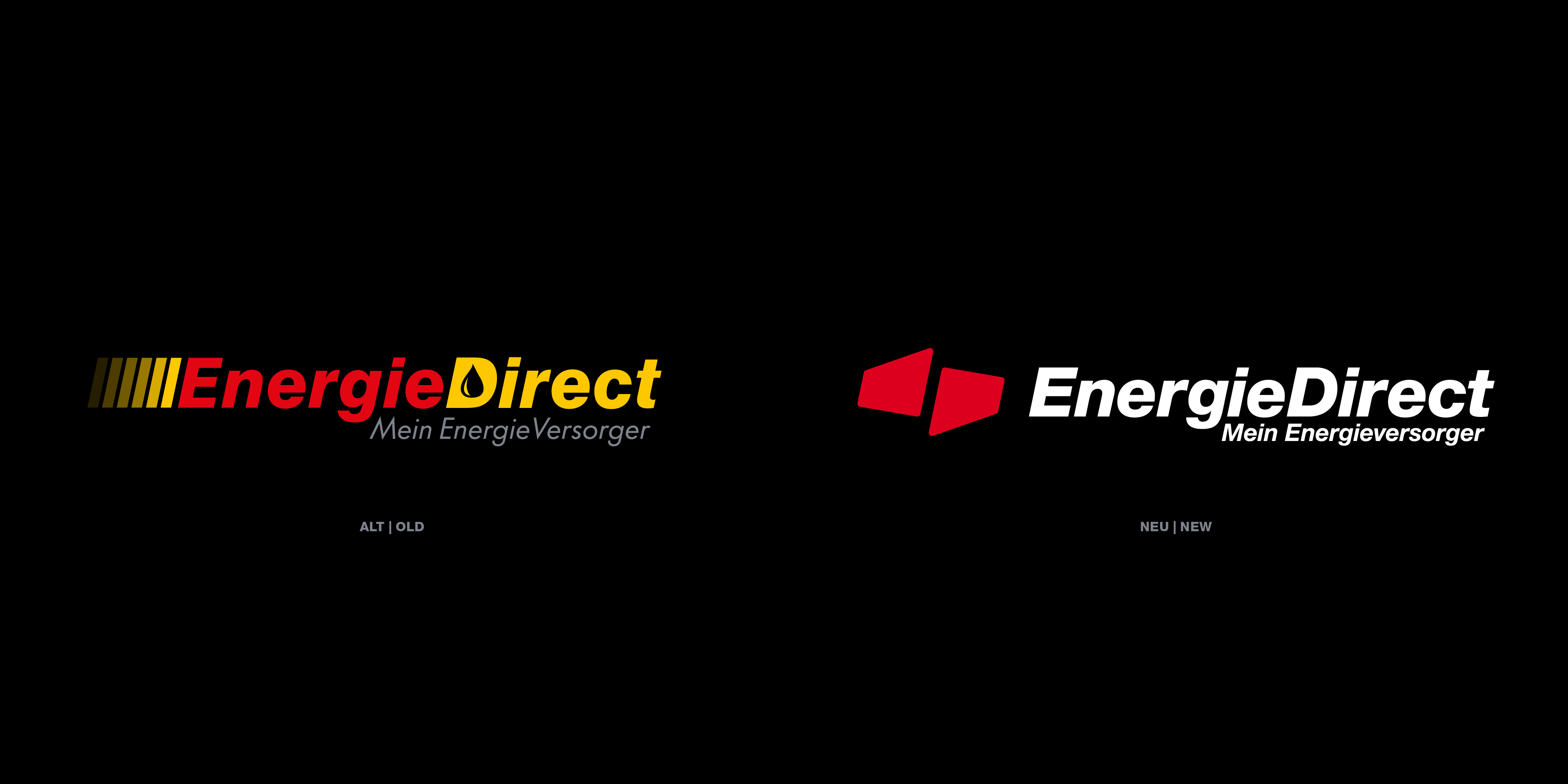
EnergieDirect brings energy producers and consumers together directly. With the ambition to be more than just a supplier, one thing was clear: the brand needed to carry its promise of a genuine partnership to the outside world. The existing visual identity no longer lived up to that ambition – the logo was hard to read, unreliable in reproduction, and had fragmented over the years into a confusing array of variants.
Our solution
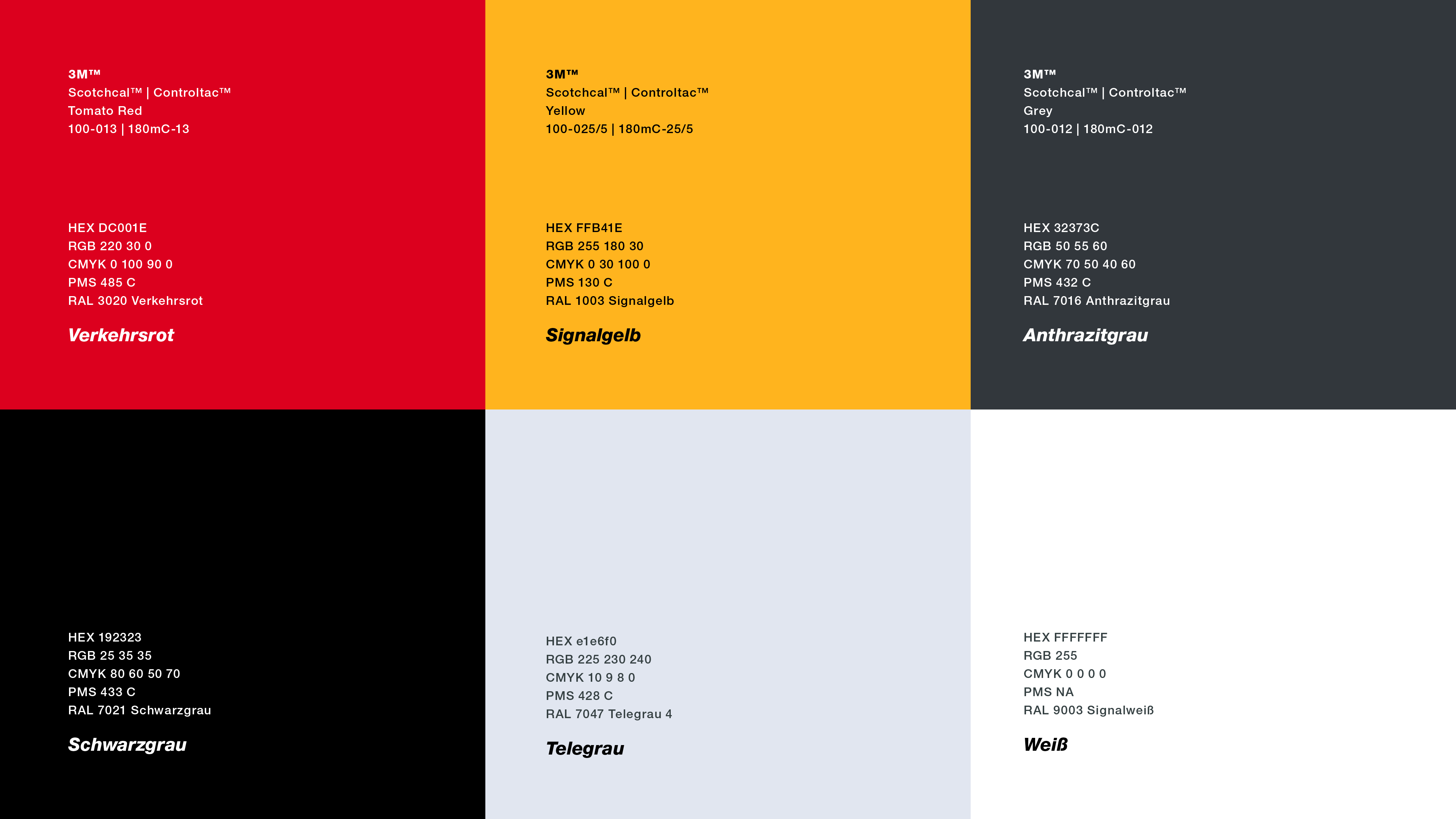
Before rethinking the visual identity, we sharpened the brand itself. Through a positioning workshop and targeted focus group interviews, we defined what EnergieDirect stands for and what customers expect from their energy supplier. From this, we identified concrete fields of action – and laid the foundation for a new, clearly structured corporate design system.
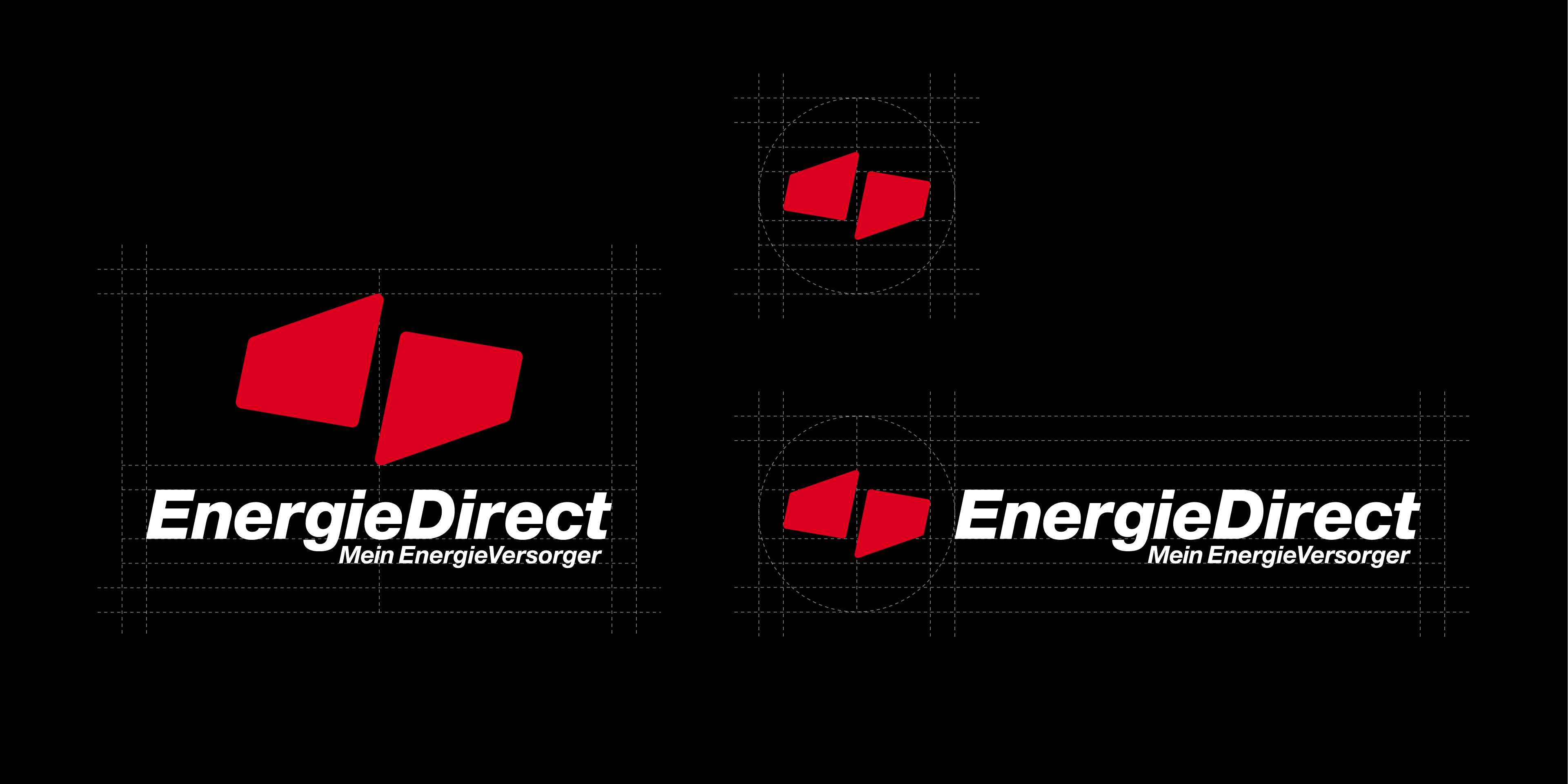
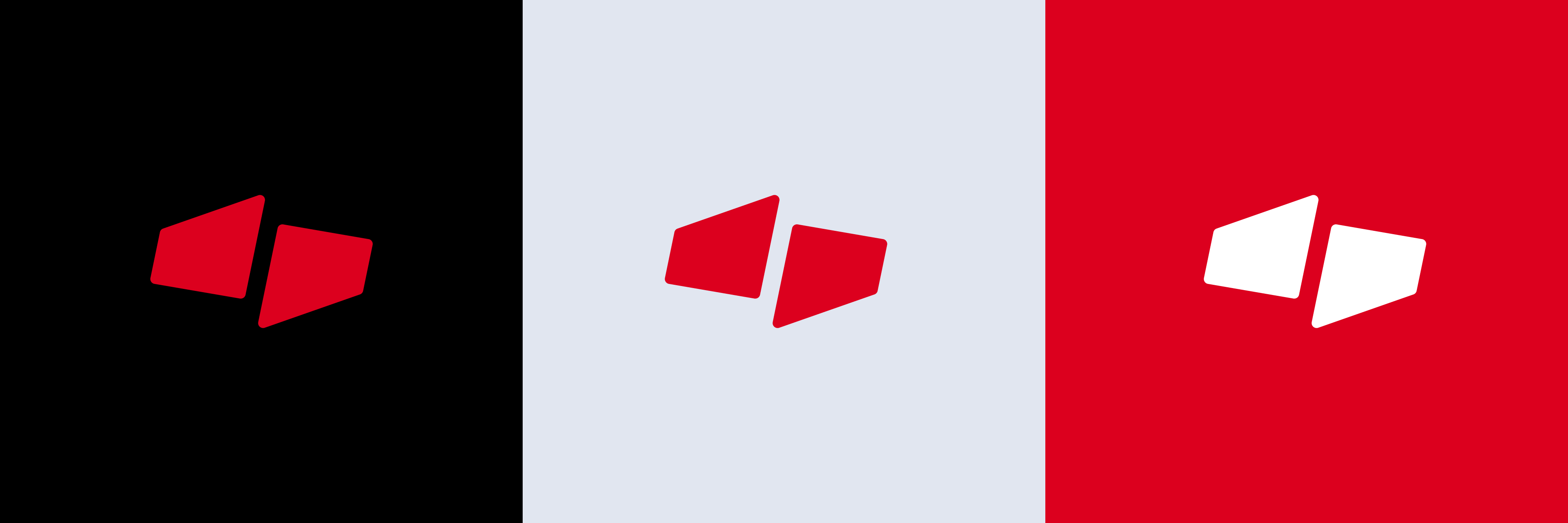
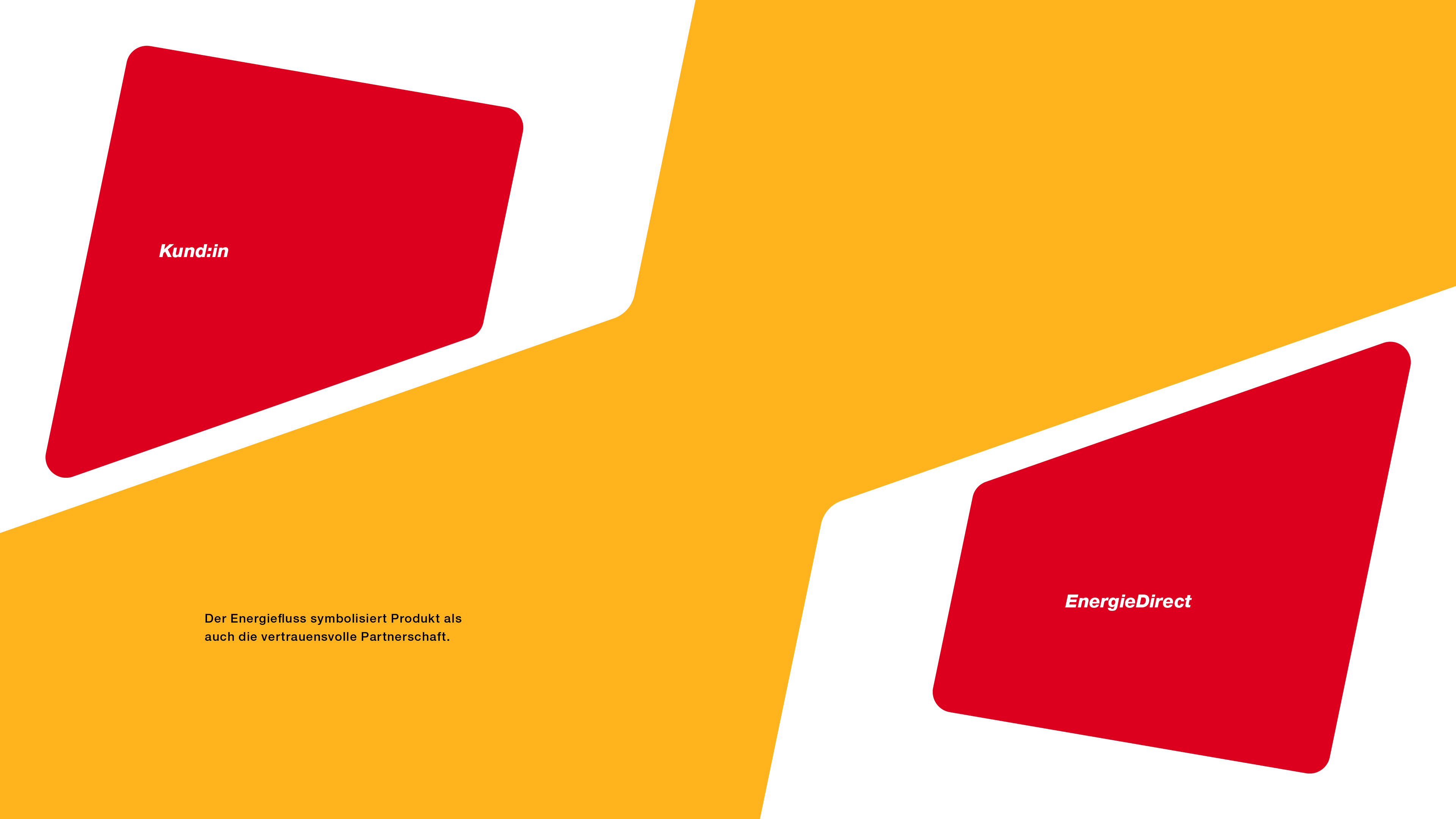
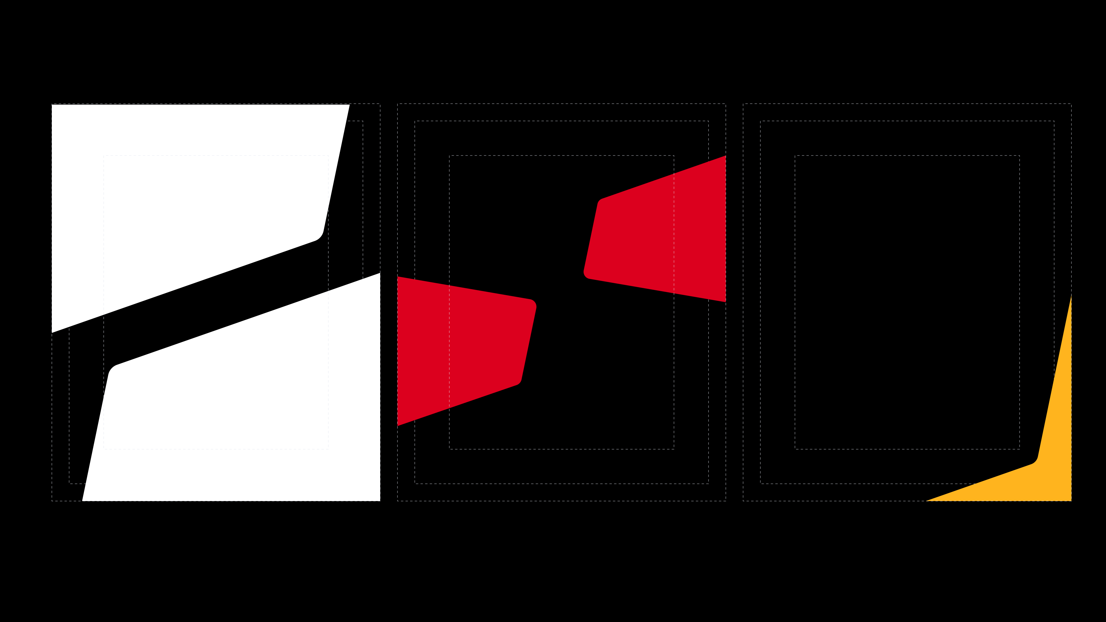
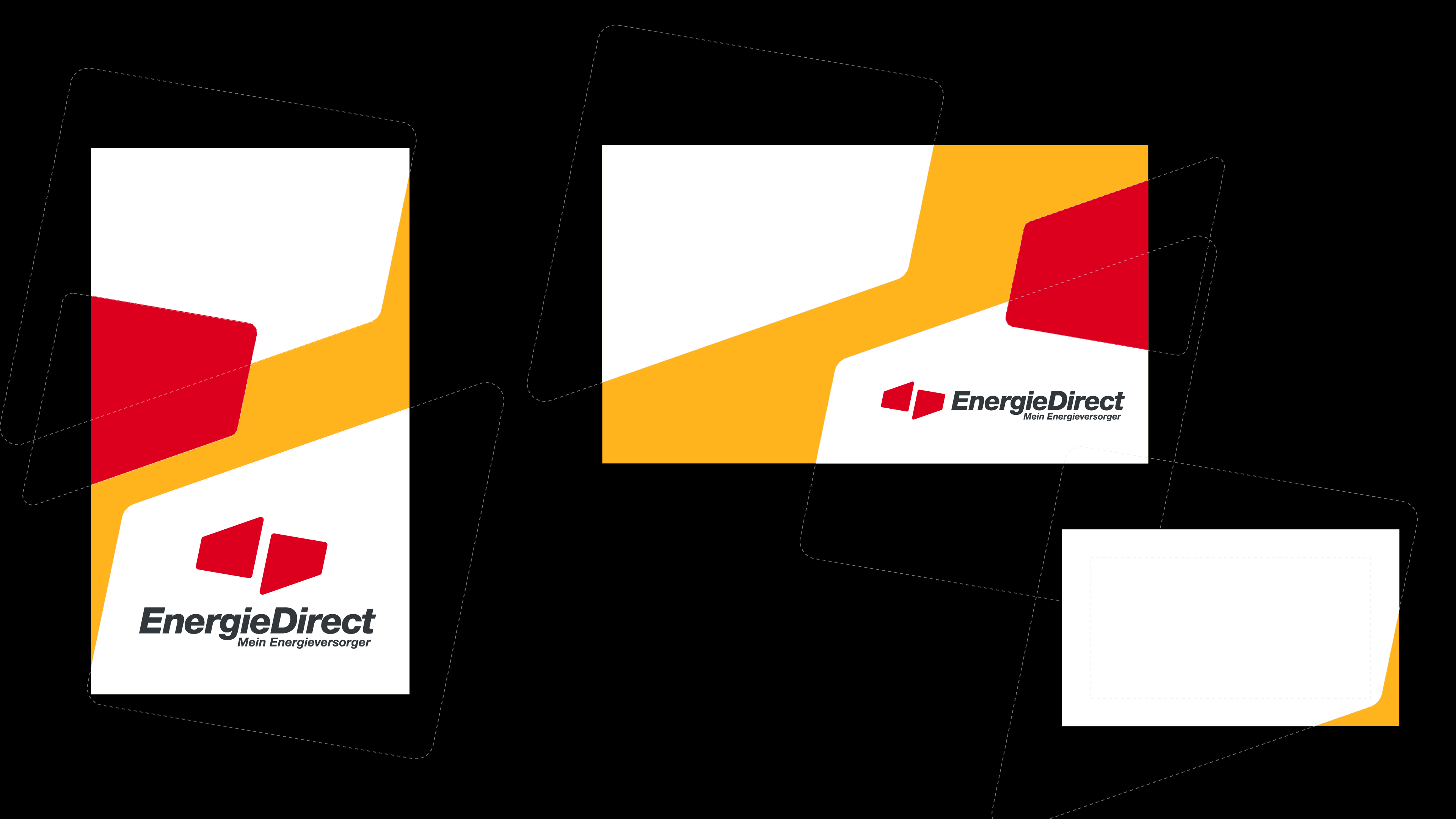
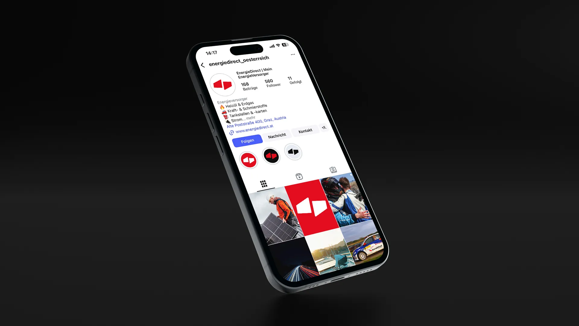
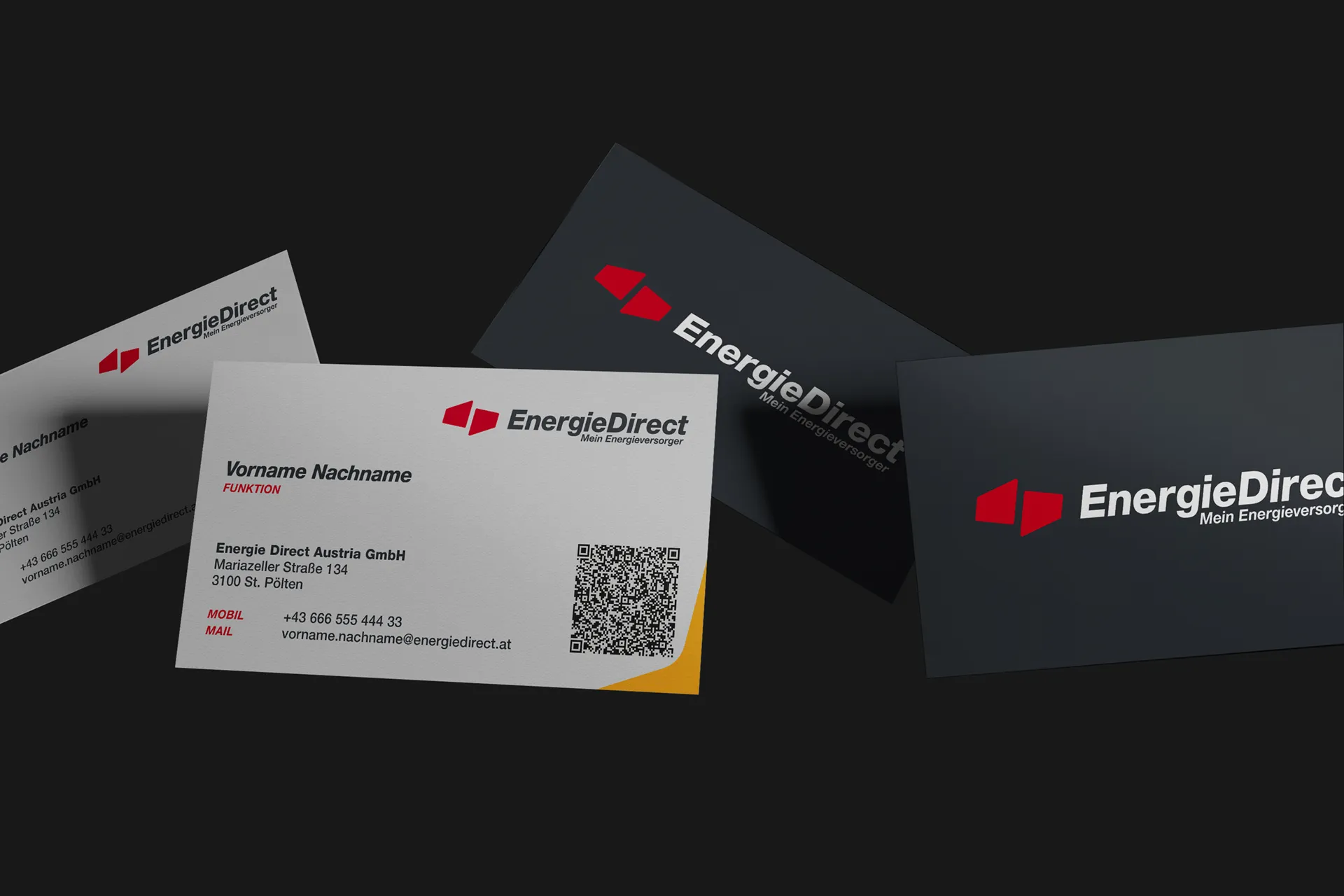
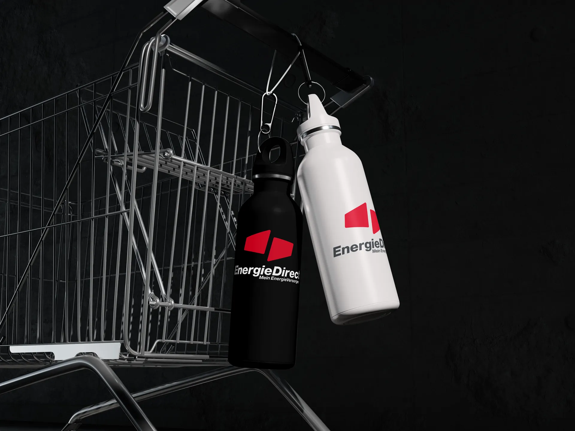
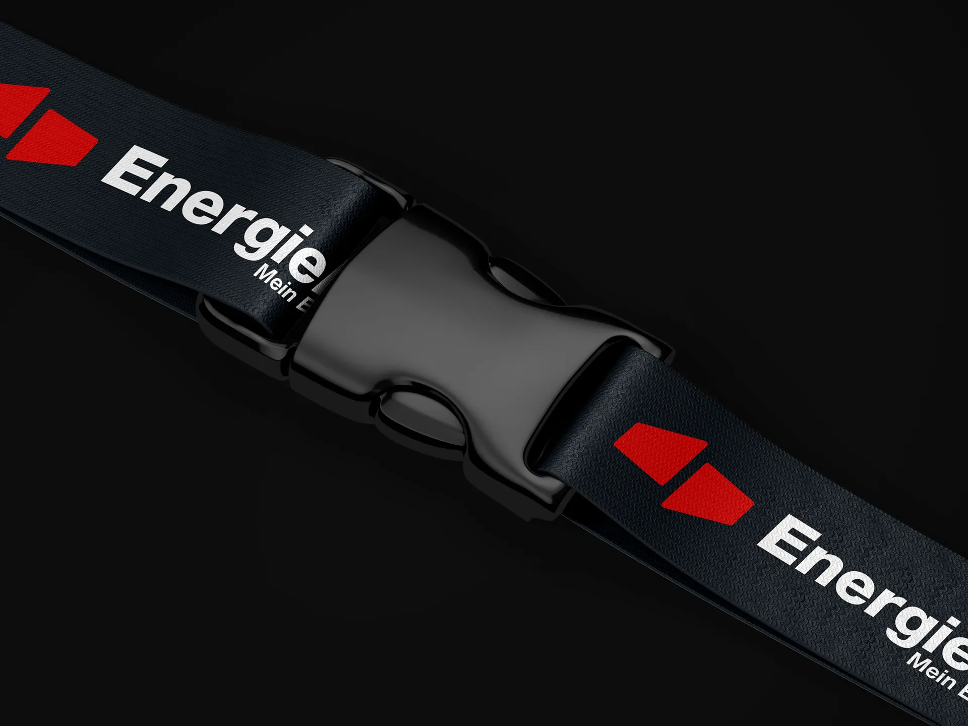
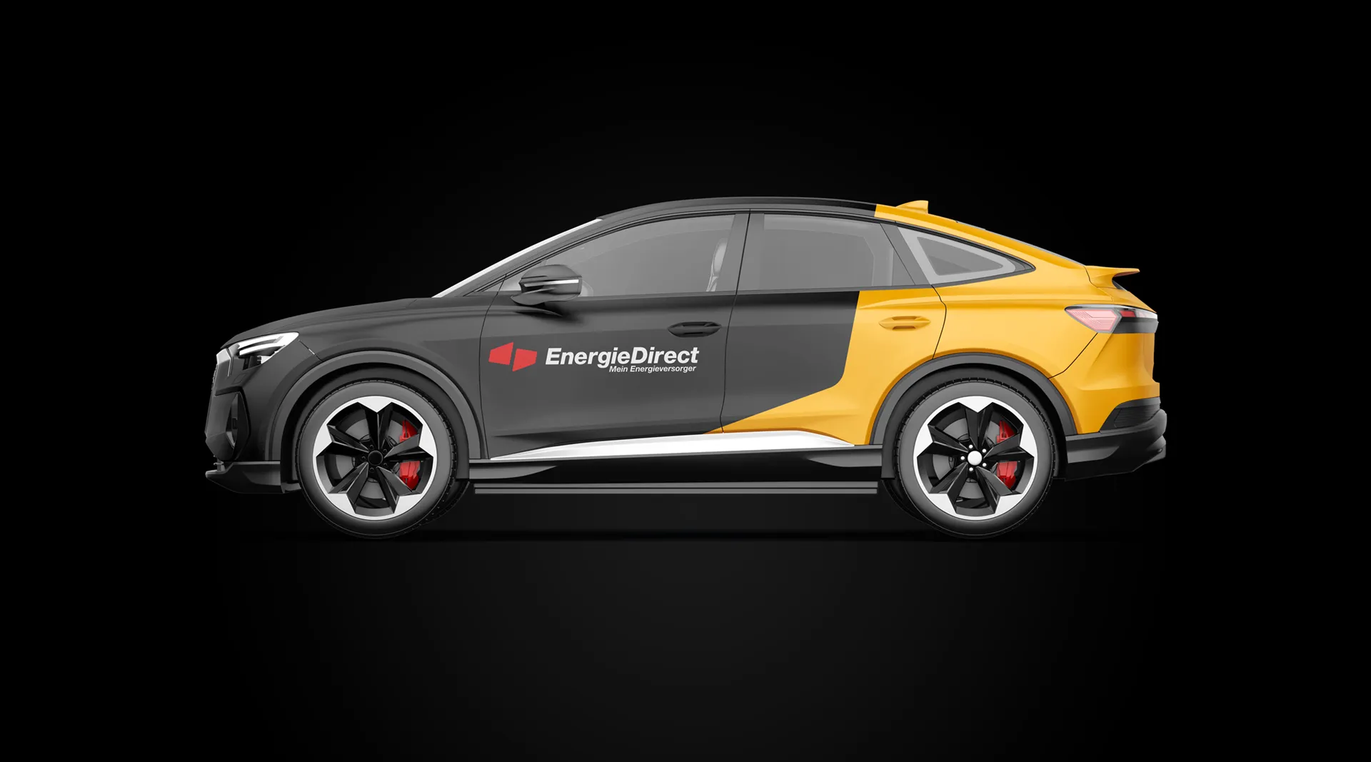
At its heart is the new signet: two opposing, trapezoidal shapes moving towards one another. At the centre stands a strong, trusting partnership between energy producer and consumer. EnergieDirect is therefore My energy supplier. This togetherness is reflected in the signet – a clear and dynamic symbol of trust, connection, and a shared future.
The result
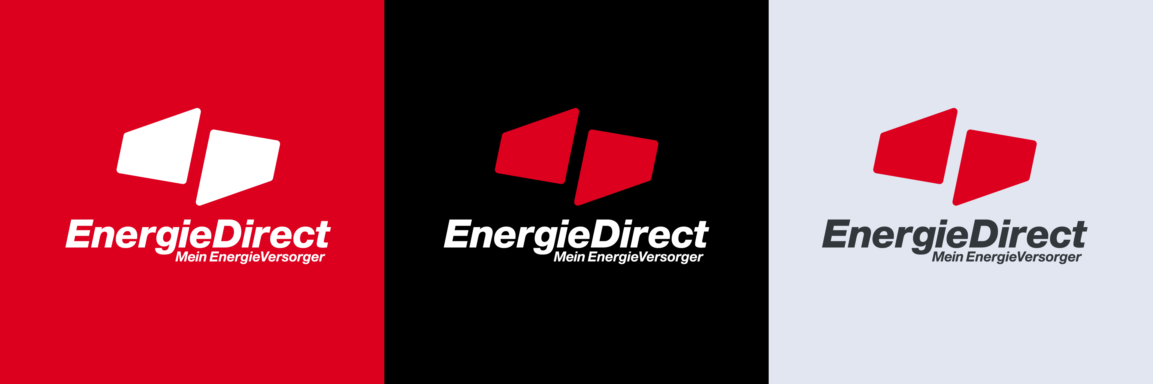
A distinctive, consistent brand identity with a logo that works cleanly across every medium and at any size. A tangle of variants has become a clearly structured design system that makes EnergieDirect’s positioning visible – and elevates the partnership between supplier and customer to the very core of the brand.

Book your free consultation meeting now