

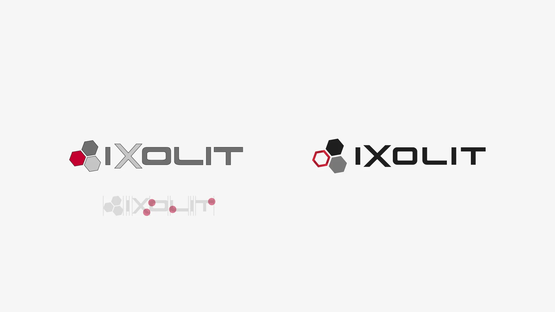
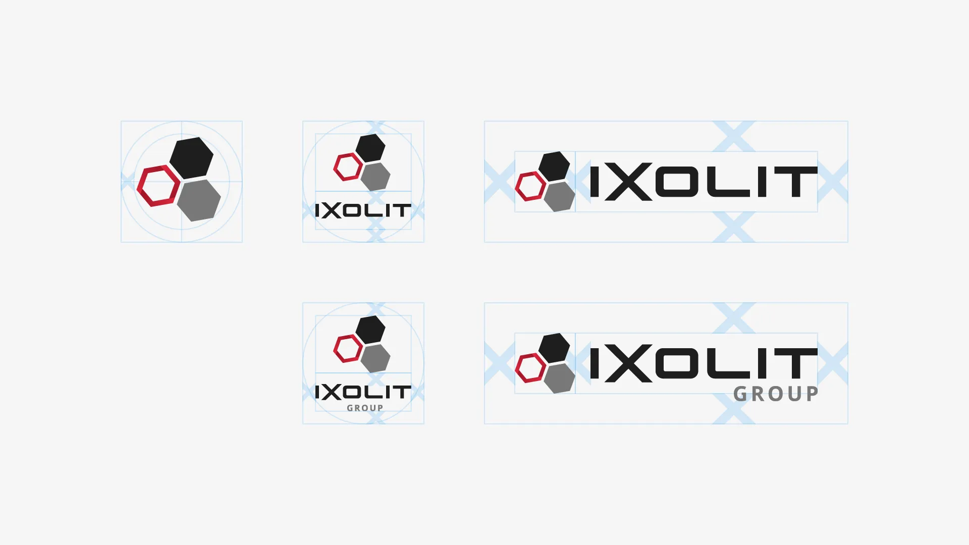
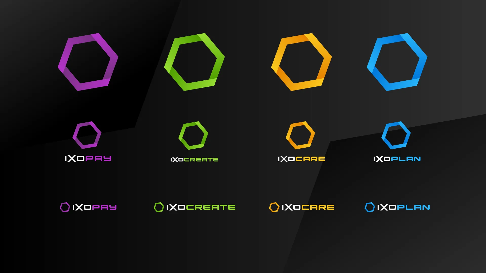
When a logo is meant to grow into a coherent whole, we’re happy to take on the challenge. For IXOLIT, we developed a logo redesign that not only looks convincing but also works – across all sub-products.
Our solution
With great attention to detail, we harmonised the entire visual identity – from the brand right down to its own typeface. A custom font gives the identity an unmistakable character and ensures that every detail fits together. Beyond the logo itself, its application on the website was also in our hands: a single mark became a consistent, flexible visual identity, ready for the spotlight.
The result
One of the sub-products, IXOPAY, developed so successfully that IXOLIT focused entirely on its further development. The design was so well received that it was kept even after the acquisition. Today, IXOPAY convinces not only through its functionality but also through a consistent brand – and we can proudly say: it all began with a logo. Thank you, IXOLIT and IXOPAY, for letting us be part of your success story.


Book your free consultation meeting now